ShopDreamUp AI ArtDreamUp
Deviation Actions


Description
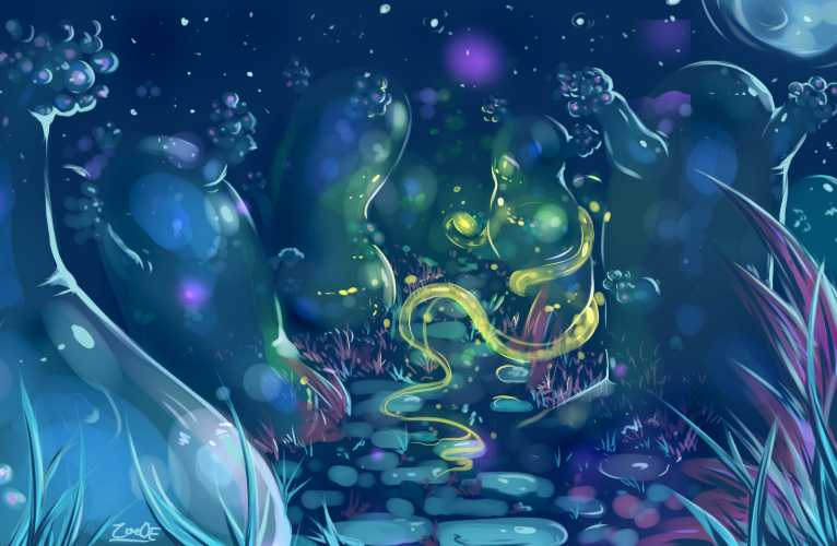
It started as a speedpaint attempt and ended up as a weird forest full of gelatinous trees.
 , I would really love opinions as to how I could have better used colour in this, and also critique on the composition.
All comments and feedback of all kinds much appreciated!
, I would really love opinions as to how I could have better used colour in this, and also critique on the composition.All comments and feedback of all kinds much appreciated!
Image size
766x500px 483.03 KB
© 2013 - 2024 oddsocket
Comments13
Join the community to add your comment. Already a deviant? Log In
Hey again!
To start off, it might be worth mentioning that speedpaints should be fast, efficient, and a way of practicing speed or developing ideas quickly....the fact that this piece "transformed" into something different to what you originally intended is good and fun, but you should focus on having an idea at hand, and developing that to an understandable stage.
This image has a spontaneity to it that communicates the essence of speedpainting well, and the idea has great originality. The slight story element of the green glowing snake adds narrative depth to the piece, and gives it more meaning than just a pretty picture. The atmosphere is fantastic, and again, your composition works very well in leading the viewer to the story element, the colour accent holding them there.
In terms of technical issues, the perspective of the path and surrounding environment does not correspond to the position of the viewer....if we are low enough to be in the grass, the ground must be closer to the viewer. A definite horizon should be established before anything is drawn, but here the perspective betrays that notion by hinting at an inclined plane that does not seem to end.
Something else that effects the solidity of the elements in the picture is the way the trees relate to the ground perspective; it is implied that they have a circular from, but the flat, wall-like bases imply something else. The circular forms of the trees should correspond to the perspective of the horizon.
Your colour selection is good, but the values have again risen as an issue, along with the interaction of light; there is no definite value scale, and the way the light plays on the trees seems scattered and falsified; the strong rim light is not explained (especially in the nearest trees) and the light does not curve around the forms as it should. A good example of this is the tree behind the snake on the left; the luminosity of the snake should light up far more of the surrounding environment if it has that kind of effect, and the light doesn't seem to wrap around that trees' from properly. Something that would improve this is to paint the light on the trees as a reflection of the surrounding environment.....this can be very difficult, especially since you're combining solid, transparent, and reflected light, but it would pay off to spectacular effect.
The way the objects lose focus in the background adds to the depth, and shows that you can control detail, but not enough to make it convincing; the foreground and nearest elements of the painting should be more solid to make this effective....in its current state the formost elements seem to disappear into the sky colour.
All in all a nice image with a great idea, but a few technical issues bring it down a little. Brushing up on your perspective and form rendering would reap better results, and always remember to paint big shapes first, small details later!
Sorry if any of the issues identified were intended effects, I'm just critiquing as to what an audience member receives.
Feel free to message me if you'd like any drawn examples of what can be improved, and what procedures could help enhance your technique.
Good luck!